


Hi Stranger,
Welcome, I'm Teo! I'm a total hybrid — I design, animate, code and art direct. Well... I also do video, photo and 3d. Can you believe I've been into this stuff since I was just 10? Computers, graphics, and figuring out how things work have always been my jam!
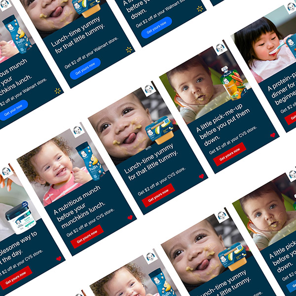
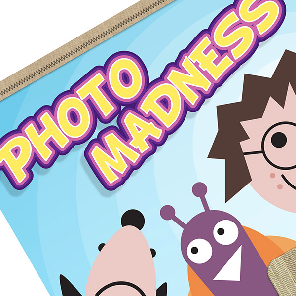
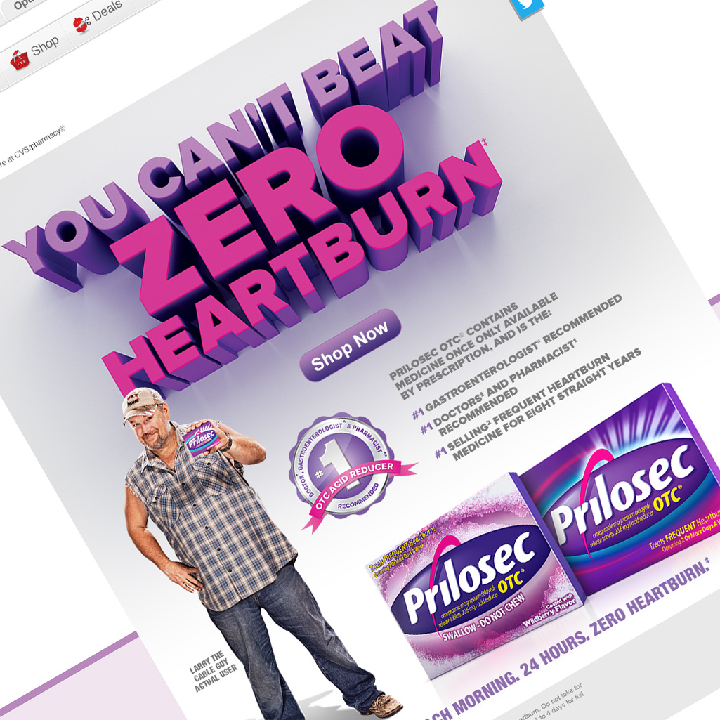
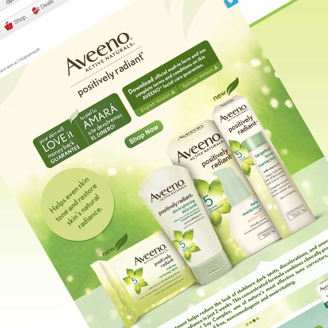
I've worked with all kinds of brands, big and small, and also collaborated with retailers of all sizes. You name it, I've probably done it!
So, if you dig some of the work you see above hit me up! Let's team up and work on a fun project together.